Capping off another great year in the design trade, the inaugural IDEA awards ceremony was held over the weekend. As an event partner for a second year running, Axolotl collaborated closely with Facet Studio, winner of not only the international category but also the IDEA Emerging Designer Award, to create an awe inspiring glass divider wall using 22 panels of Viridian glass. Based on the theme of a playful Aesops-Fables-esq scene, the edge lit glass was etched with the theme on the rear face and painted strips on the front to give the passer by a unique experience and insight into the possibilities of the glass medium. The theme comes alive with the effect, as the animals displayed appear to move with every step.
Working with Facet again, in conjunction with Balvenie Scotch, Axolotl was called on to create a circular pop up bar for the Awards, constructed of stained wood, with an aged copper countertop crowned with an etched Balvenie logo. The awards themselves were also created by Axolotl, adopting the same theme as last year, these awards were coated in aged aluminium with a combination of textures overall highlighting the refined IDEA logo. In all, the night was a resounding success and we would like to offer our heartfelt congratulations to all the winners and the IDEA team.
Designed by Michael McCann from Dreamtime Australia Design, the new Grain bar at the Four Seasons Hotel in Sydney, is the perfect debut for our latest innovation, Axolotl Timber.
By applying semi precious metals onto timbers or timber veneers and manipulating the raw materials, a unique surface element is created. The organic warmth of the timber grain contrasts the industrial lustre of the metal to stunning effect, as demonstrated here on the Axolotl Timber feature wall. Michael McCann hand selected a beautiful American Cherrywood for Axolotl Gold Bronze, which has been applied in a custom geometric pattern.
Axolotl Timber offers an unlimited design canvas through being able to combine any metal design onto a vast range of timbers.
Says Michael, "Grain has been designed as a unique “artisan” bar, blending a variety of commissioned artist finishes and features in timber and other medium. The name “Grain” was selected to reflect this – i.e. “Grains used in alcohol distillation" & “Woodgrain”. Grain features a blend of highly creative features bordering on the theatrical – yet at the same time elegant, warm and comfortable with a creativity-focused interior. Axolotl Timber plays a pivotal role in helping us realise this concept ".
Another great use of Axolotl Timber was recently illustrated at our DesignEx 2012 Exhibition. Below is a video of the stand, created by Steve Brown.
[vimeo http://www.vimeo.com/51658062 w=640&h=360]
Axolotl at DesignEx 2012 from Axolotl on Vimeo.
Introducing the latest addition to Axolotls signature door range, this architecturally detailed door in Axolotl Concrete is a world first. Clad in a fluted profiled substrate and coated in our award winning 'shale' concrete, the door appears as though cast from solid concrete, however due to Axolotls patented (pending) technology carries none of the associated risks or restrictions of solid concrete which can include weight, need for structural reinforcement, and brittleness causing chipping.
A similar profile on a larger scale looks great in metal also, as illustrated in the recent fit-out at the Ray White head office. Coated in Bronze Florentine, the ridges area of the three dimensional panels are polished to reveal the bronze through the areas of aged florentine.
Axolotl are extremely fortunate to work with some of Australia’s most talented designers and architects. It goes without saying then that we are delighted when their efforts are recognised by both their peers and industry bodies. So far this year several teams have received various awards and nominations commending their efforts across various projects involving Axolotl, with just a few featured here.
Philip Chia aimed to redefine the traditional food court dining experience at The Galeries Victoria by creating a highly unique and intriguing environment by delving into experimentation with juxtaposing materials. Axolotl provided several unique surfaces such as concrete coated panels with custom carved design, for the bulkhead and ceiling trim. Bronze Viper panels for the kiosk stations, and Treasury Bronze Pearl feature walls.
Commendation Retail Design - The Uncarved Block For The Galeries Victoria
The design concept for the lower ground food court at Sydney's TGV aimed to set this unique environment apart from its counterparts in the CBD and stray from the “a-typical” food court approach. Inspired by the existing mix of avant-garde fashion retailers, the current clientele and location, the food court design draws a link between these key influences and the art of consumption conveyed through unique bespoke design elements, materials palette, texture, lighting and furniture.
Melbourne Central was recognised for it’s creative eclecticism and environmental stance, which also offers a unique retail experience. Given the large size of the space, it was important to create a variety of smaller dining areas for different groups of people. Axolotl was called on to produce a divider wall using screens coated in Treasury Bronze Pearl.
Planning wise, the layout defies the number one rule of food courts where sight lines to all tenancies from anywhere are a pre-requisite. At Melbourne Central, deliberately massed visual obstructions breaks up dining zones and changes the overall visual typography. It relies on people’s innate sense of interest and intrigue to explore this environment.
The conversion of the seating pagoda in Dixon Street to an information kiosk to service Chinatown called for a sympathetic and contextual design. The curved glass feature wall, created by Axolotl, is coated in Graphite which has been applied in a bespoke pattern designed by paper-cut artist Pamela Mei-Leng See.
In honour of the late, great Harry Seidler, this park was created for the residents of North Sydney. A large glass blade, supplied by Axolotl, installed at the centre of the space, details the dedication of the park to Harry and his lifetime contribution to architecture.
Designed in conjunction with Phillip Chia from The Uncarved Block, the Axolotl ‘Pod’ is a bespoke construction based on the blueprint of a shipping container, which we tweaked to our exacting requirements. With sustainability in mind, the reusable structure will be recycled for future exhibitions, reconfigured and transformed into an all new stand unrecognisable from the last. This year we featured several amazing world-first products including Timber LINK, Concrete Lace, Chroma and LINK glass along with many other beautiful finishes.
The “Reptilian Chaise” was designed specifically for Axolotl Concrete Bunker, to demonstrate the versatility of our new concrete coating system. The bespoke fabric, imported from Timorous Beasties, played a pivotal role in the design of the chaise - the pattern of the fabric flowing seamlessly into the concrete, creates a juxtaposition of soft and hard surfaces, whilst illustrating the unique properties of the concrete process.
The annual awards, widely regarded as the most prestigious hospitality design prizes in the business, attracted 620 entries from 60 countries. The awards will be judged by the who's-who of the international design and hospitality industries, including Alberto Alessi from Alessi, Joe Ferry from Intercontinental Hotels Group, and editors from Casa Vogue Brazil, Elle Décor India, Frame China and the UK's Sunday Times Style. The winners will be announced at the Royal Institute of British Architects in London on September 6.
Axolotl would like to extend our congratulations to the winners and look forward to partnering on more award winning projects in the future.
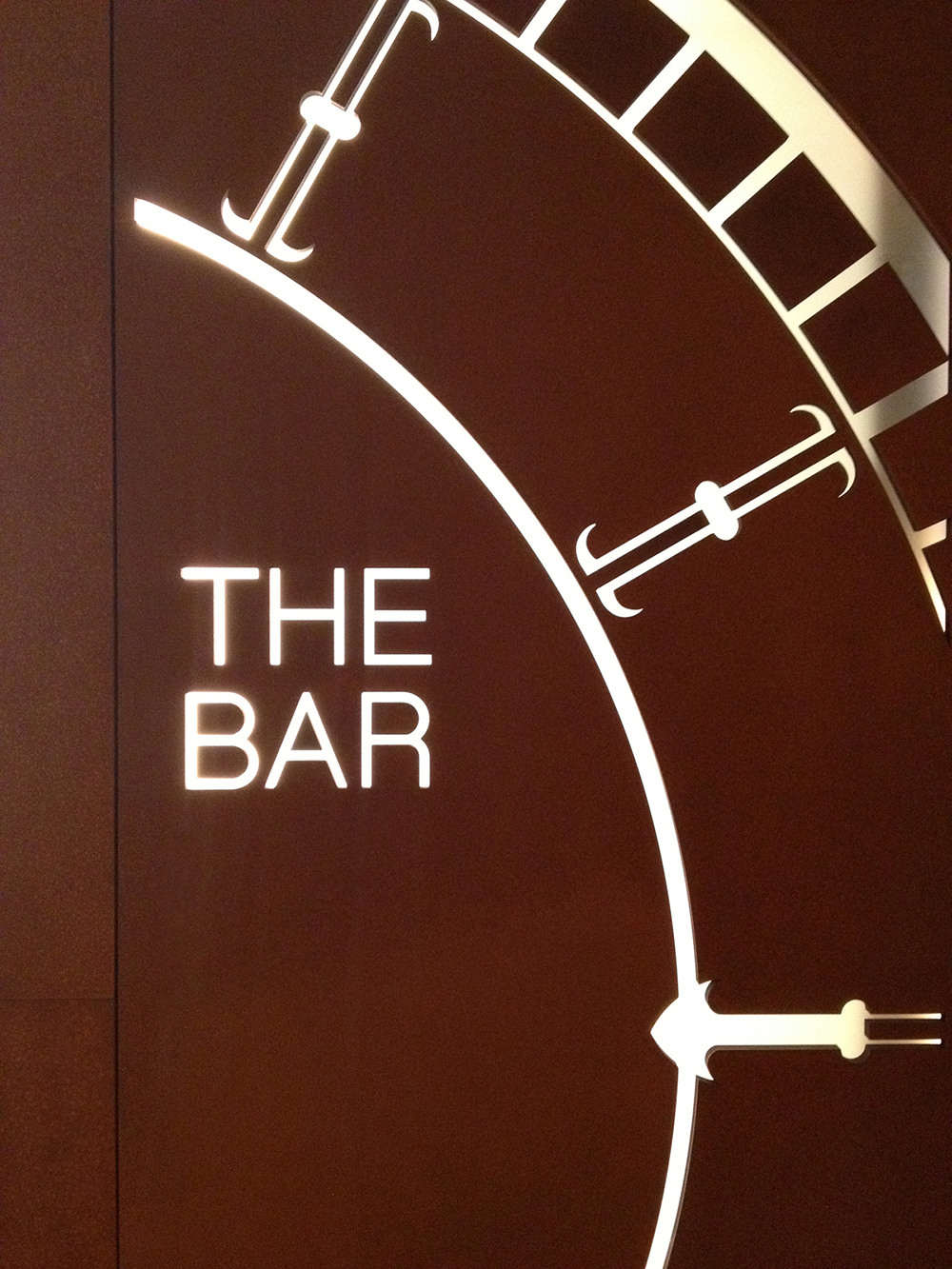
From the creative minds of the talented team at JPDC, comes the latest venue to hit the Sydney bar scene, 'The Bar' at one of the most prestigious Hotels in Sydney's CBD. Axolotl were engaged by Joseph Pang, principle at JPDC, to design and create the feature walls and signage for the moody interior inspired by a vintage timepiece motif.The luminous backdrop for the bar was fabricated by Axolotl employing a combination of processes and techniques to produce a unique and entirely bespoke feature. Laminated MIRO glass with translucent printed interlayer is inlayed with Axolotl LINK in Rust, demonstrating to great effect Axolotl's ability to combine multiple processes and products across our glass and metal ranges to create something truly original.
Entry to the bar is flanked with a lasercut feature signage wall in Rust which echoes the timepiece concept and materiality running throughout.
The entry to this Northern Beaches residence is another stunning example of Axolotl LINK combined with laminated MIRO glass. Here we have inlaid Treasury Bronze into both faces of the glass in a custom screen like design to create depth and a multi-dimensional quality. Laminated with a soft white interlayer, the translucent panel retains sufficient privacy whilst still allowing movement and the transmission of light into the space beyond.
Concrete LINK
The latest addition to the LINK range is our new Concrete surface applied onto or inlaid in to glass. With this particular example we have first applied the concrete entirely to the glass surface, then etched through the concrete, simultaneously articulating the design and creating translucent areas through the glass.
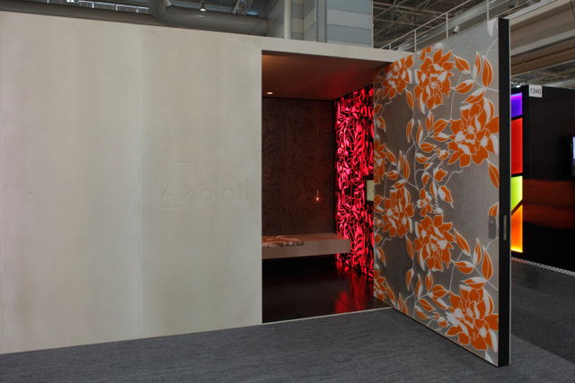
DesignEx 2012 was another inspiring and successful event with more than 2000 people visiting our stand over three days. It was really exciting to see it all come together and we loved hearing such a positive response from everyone who visited the stand. This year we featured several amazing world-first products including Axolotl Timber, Concrete Lace, Chroma and LINK glass along with many other beautiful finishes. The stand was colourful, innovative and unique, created using the many materials that make up Axolotl. The pictures really do say it all.
A special thank you to Philip Chia and The Uncarved Block team, for once again partnering with us to create the stand, and to all of our suppliers, who have made this years success possible. Thank you to all those who managed to attend, we hope to work with you soon.
Axolotl Showcase: Studio Becker
Axolotl continue to be at the forefront of commercial contemporary design in Australia. Proof of this is our recent collaboration with Dale Jones Evans Architects in conjunction with one of the most exciting, international kitchen manufacturers - Studio Becker. The Studio Becker showroom located in Redfern, officially opened on the 20th of August, bringing their uniquely beautiful, yet remarkably functional, kitchens and wardrobes to the most stylish Australian homes.
Axolotl was entrusted by Studio Becker to provide a range of bespoke glass pieces for the Sydney showroom, including Veil, Miro, Lustre and Mirror. It's showroom entrances from start to finish and is the perfect testimony to Axolotl's capabilities when it comes to contemporary glass design and innovation.
Axolotl would like to officially welcome Studio Becker to Australia and offer our congratulations to Fiona Lochtenberg on her new venture.
Axolotl have been busy this last quarter working on projects as diverse as the new Westpac on George Street, the Wentworth Hotel and the new Rouse Hill Town Centre. All are major projects and all quite diverse in their style.
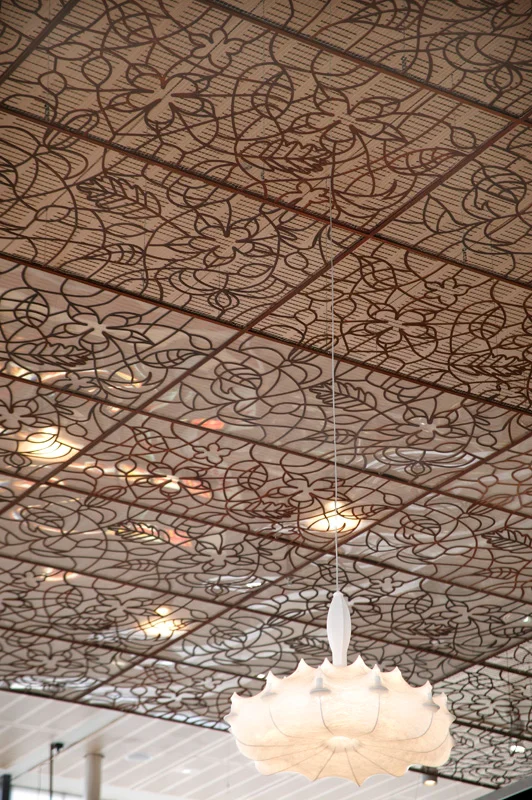
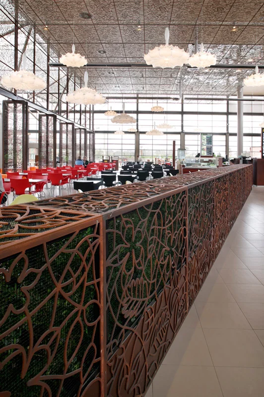
Rouse Hill, pictured above and below, comprises over 1000 sq m of rust coated lasercut aluminium screens, door frames and I beams. To match the design, the glass in the 48 four metre tall door frames were printed with Axolotl’s new Miro laminated glass 13.52mm thick.
The overall effect is quite spectacular thanks to the genius of Philip Chia. It’s definitely worth a trip to Rouse Hill for a look.
Axolotl currently have over 150 projects underway that include Lindt, Star City, Rockpool, Park Regis, American Express and Ernst and Young.
Miro shows off its beautiful qualities at the Loft Lounge in Melbourne, and on the stunning Milne & Stonehouse commission located in Brisbane's inner city.
The secret of Miro lies in the printed interlayer which is laminated between two sheets of glass. Any image, pattern or graphic can be incorporated and the interlayer can be clear, translucent or opaque. Both faces can be viewed but are always protected making the finished product both practical and versatile.
Internally the panels can be used in feature walls, doors, balustrades, art pieces, splashbacks or shower screens. Externally the designs can be used for awnings, balustrades and facades.
Any design or image can be printed - so Miro isn’t just amazing to look at, but one of a kind


